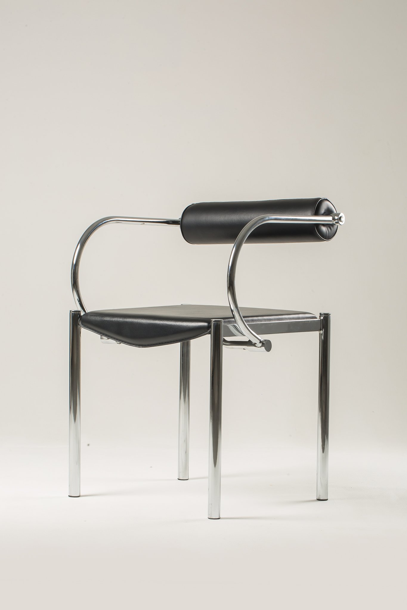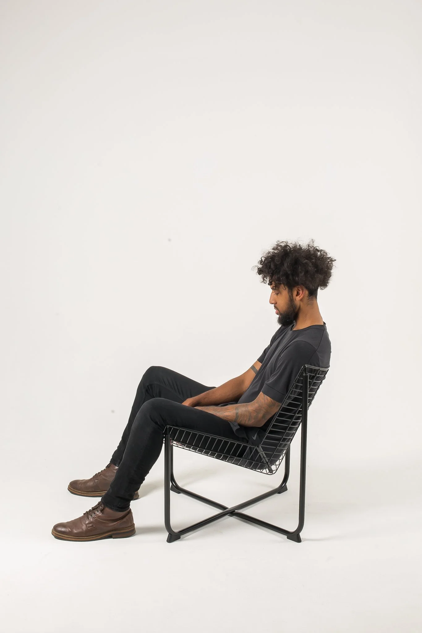

CHAIR FAIR
IS A FULL IDENTITY DESIGN FOR AN INTERNATIONAL CHAIR FESTIVAL. DURING MY STUDIES I WORKED WITH TALENTED DESIGNERS, DENICA ZDAVKOVSKA AND CAMILLE IVY TO CREATE THE MULTIDIMENSIONAL BRANDING FOR THIS FESTIVAL.
FESTIVAL DESIGN
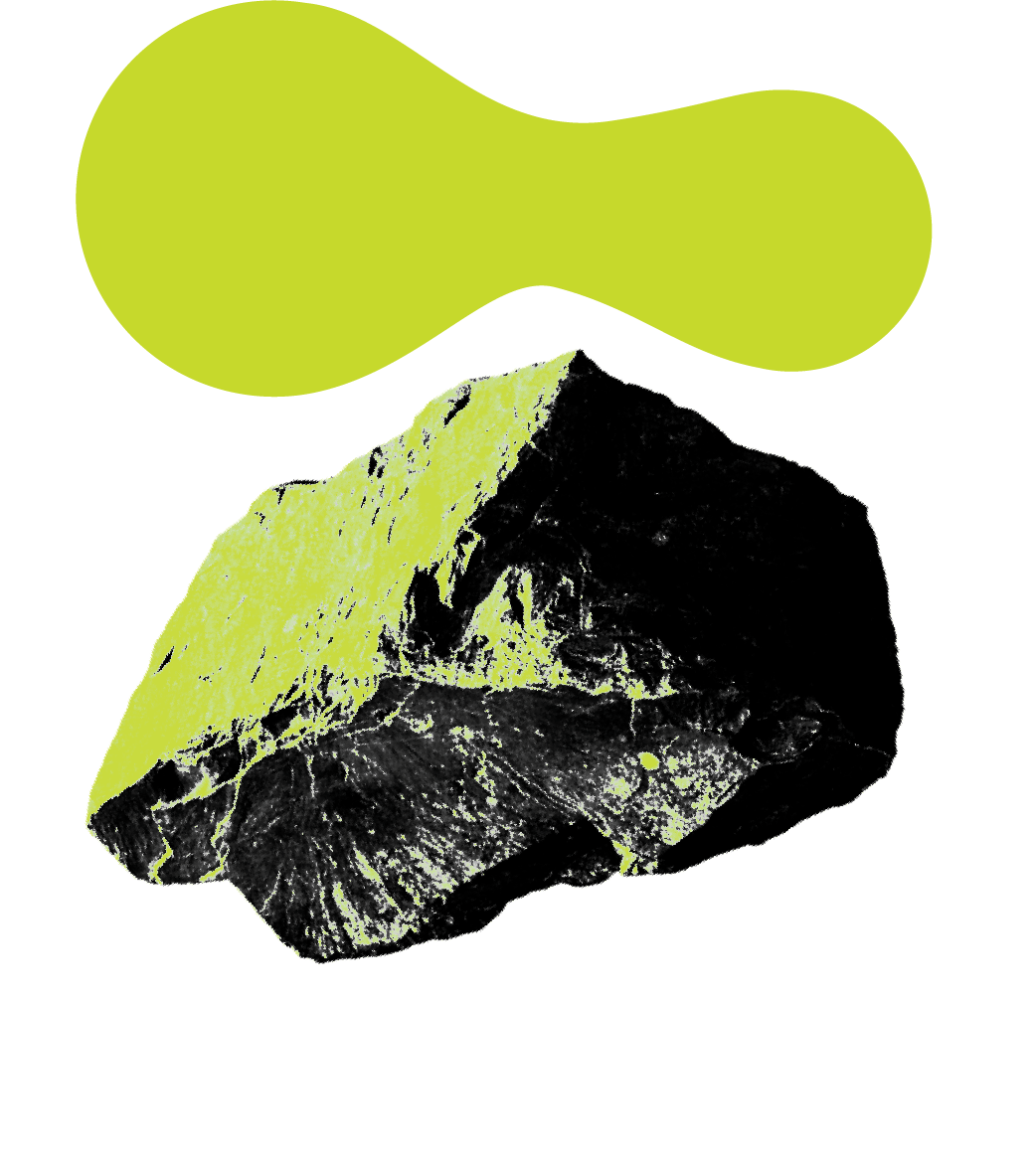
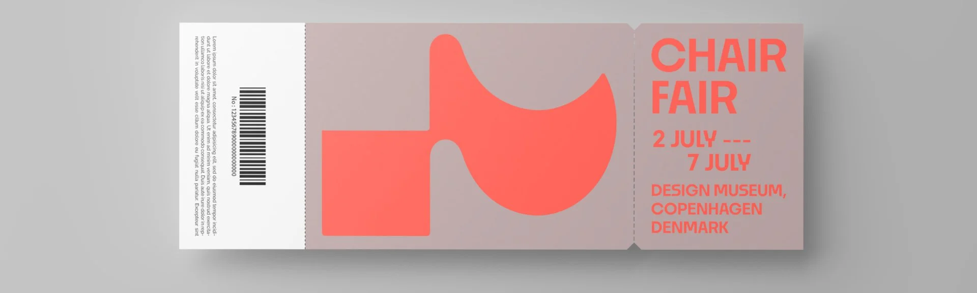
The logo emblem was designed to embody the delicacy of chair design and the form of the people they are made for. It is bold and contemporary. The color palette is progressive and warm highlighting bright tones.


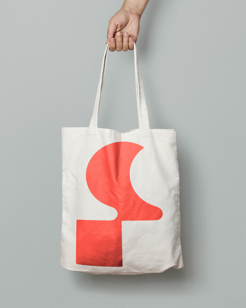


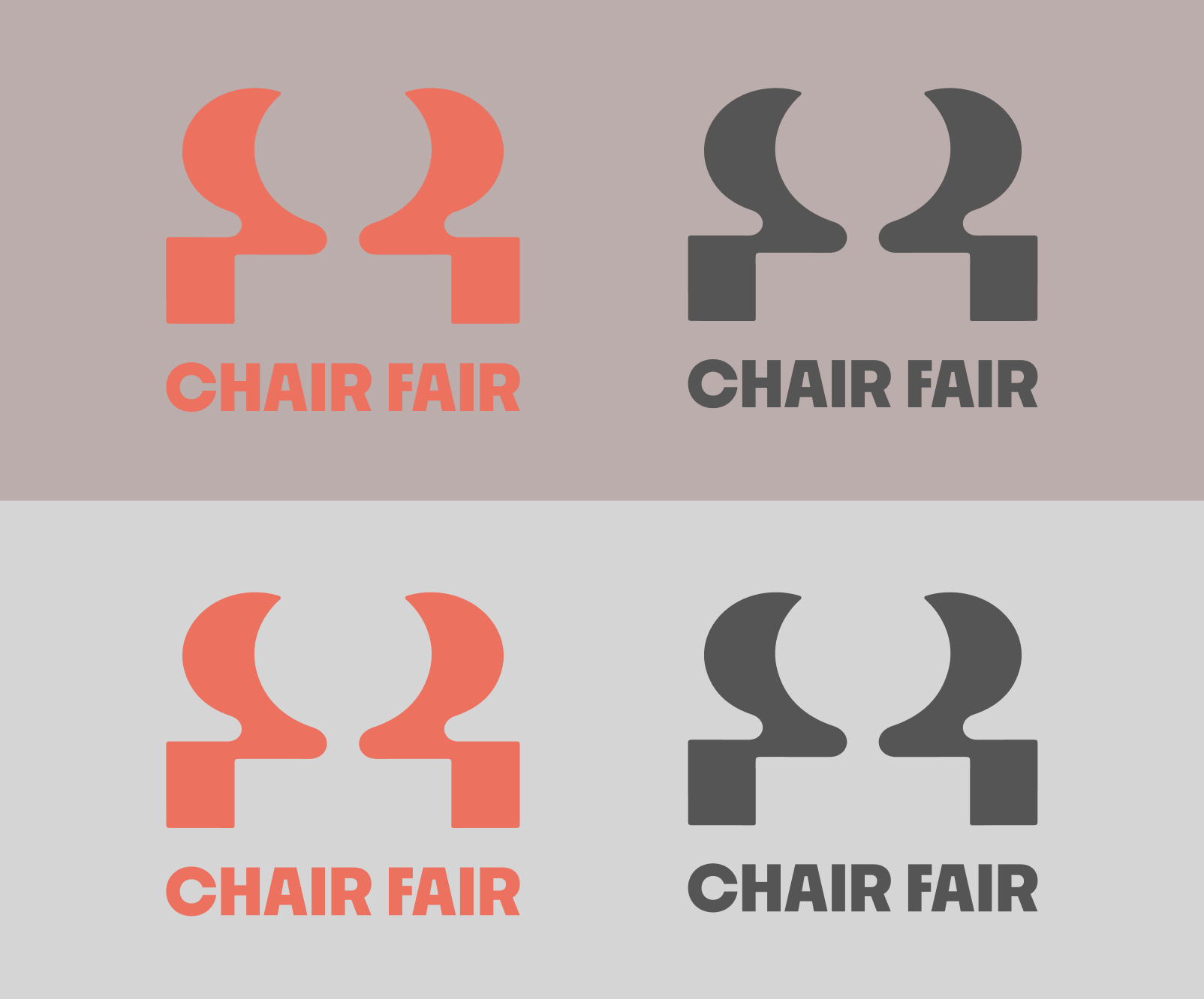
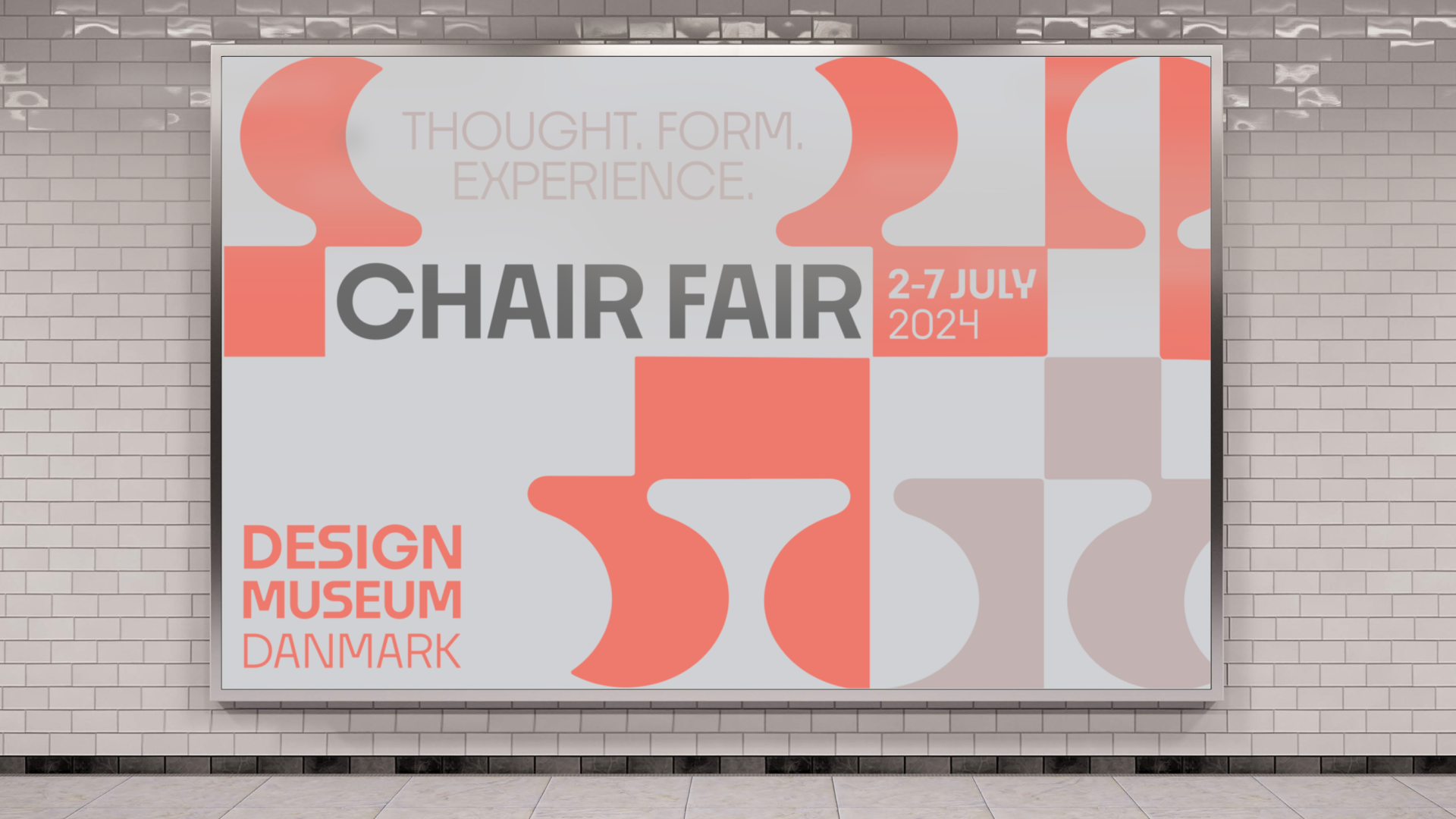

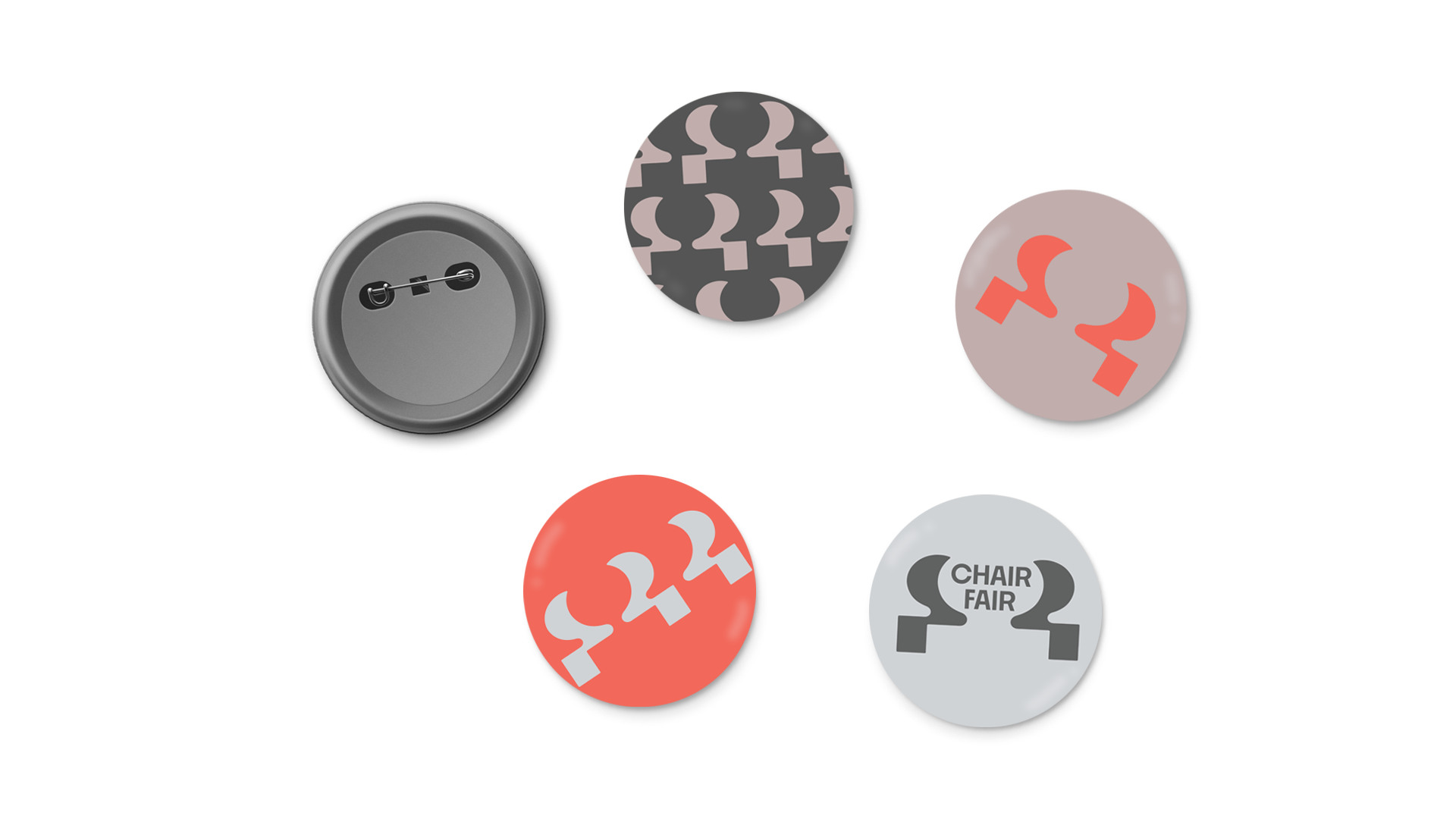


The work for Chair Fair exemplifies branding that reaches the desired audience. It is elevated, clean with a progressive color palate. A major focus for this identity is that it brings together practical function of a chair with the character of human creativity. Where chair meets person. The branding for the festival also executes a flexible identity. The logo emblem translates into patterns and diverse layouts for digital or print. The project includes design for web, social, art direction, print, and editorial. The logo expands into multiple applications yet maintains a consistent visual language.
Flexible identity systems create a lot of potential for a brand. In current graphic design practices we are able to utilize more potential in digital applications. This evolution in design moves us away from using one stagnant logo to represent an entire brand. Creating flexibility in logo systems means that a brand can be expressed in a multitude of ways yet still be recognized seamlessly.